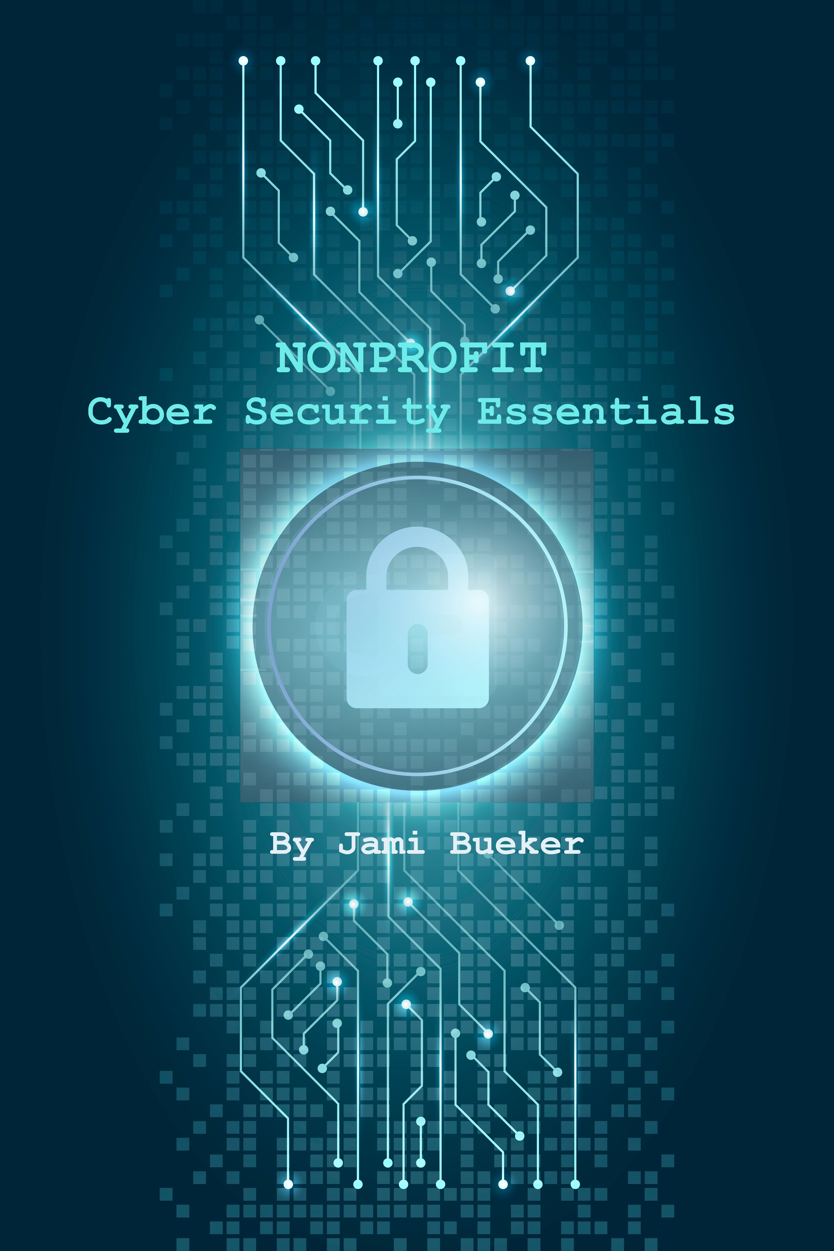
For the digital book cover, I created a bitmap montage using the image editing software GIMP, incorporating several images sourced from Freepik.com. I combined the images and text to form a composite illustration for a fictitious book, Nonprofit Cyber Security Essentials. My research focuses on the factors — both positive and negative — that influence a nonprofit organization's ability to effectively fulfill its mission. If this book were to be developed and published, it would serve as a guide to educating nonprofit leaders about the risks of cybercrime and the best practices for safeguarding their organizations' assets. There is a need for this book because there are daily reports of data breaches, fraudulent ACH transactions, and ransomware installed on company mainframes. With the expanding digital landscape, prioritizing cybersecurity is imperative. Nonprofit organizations, facing limited expertise and resources in cybersecurity, are particularly vulnerable. I wanted the book cover to evoke an ominous, futuristic vibe to reflect the complexity and uncertainty of the digital landscape. However, I did not want the cover to feel frightened or evoke fear, so I intentionally avoided using the color red. According to Canva (2024), red symbolizes intense emotions like anger and fear. Instead, I chose varying shades of teal for the background, which Canva (2024) explains is a combination of blue and green. This color evokes calming and rejuvenating feelings and is often associated with open communication and clarity.